Friday, April 30, 2010

FLOWERS

Hey everyone! So I really enjoyed the flower project, I really liked the use of color in the flowers I used as well as the water droplets and composition! Let me know what you think. These are my final two that I have been working on, and I am going to use them in my portfolio as well!
Thanks!!

Photoshop CS5 Trial

I decided to google Adobe CS5 to see when the release date was, and I was sent to cs5.org, the unofficial CS5 blog. First thing I saw was an add for a CS5 trial. Thinking it was too good to be true I clicked the link and it sent me to the adobe website where you can download any CS5 program as a trial. Here's the link for the Photoshop CS5 trial.

https://www.adobe.com/cfusion/tdrc/index.cfm?product=photoshop

Notcot and the IMPOSSIBLE project

My brother sent me a link to notcot.org recently. This site has endless projects and works by brilliant people. I'd suggest getting lost over there for a while. Just don't forget to come back to make your own crafts, photos, sketches, paintings, and anything else you can imagine. I promise you there's something for everyone here.

Also, do a search for Asher Eggleston and you'll find where my brother was featured and his website.

Johnny Cupcakes Cannon


---
In case anyone was concerned (I was), there's no need to fear for the life of instant polaroids anymore. As far as I can tell, the IMPOSSIBLE project is taking care of everything. They're selling cameras and film, accessories and books now, although it looks like they're completely sold out for now.


-Lisa

Tuesday, April 27, 2010

Honey, I'm home!


Here are a couple self-portraits I took last weekend. Rob and I enjoy dancing to soul music and I thought it would be fun to capture a few shots. I know mirror shots like that can be corny but I want the outside view of an intimate moment.

Monday, April 26, 2010

Birthday


I'll be 24 in 10 minutes.

It is depressing, after 18 I think they're all depressing.

Another year gone by and I feel like I accomplished a lot with this one, I also think I destroyed a lot in the past year too. 1 year ago I was positive I couldn't get into a college if I tried, I upset people close to me, I got really upset a lot, I punched a lot of holes into walls and took a trip to Strong Memorial at 2 in the morning. I've lost my job and got new ones. I'm broke in comparison to the past but I'm rich in comparison too. I've got a future but don't know where I'm going. I know exactly what I want to do and have no clue what I want to do. I've moved 4 times in 12 months and will move again in August. I've driven probably 30 or 40 thousand miles (no exaggeration). I've learned a lot and tried to forget even more.

5 minutes to go and I feel like I'm going to have a breakdown


ps. too late i'm 24

Dave Hill video

hey guys,
Dave Hill is one of those guys that you've seen his style copied about 1 million times.
here is his behind the scene video for a verizon ad he shot, he has a lot on his vimeo page and his website is full of great portfolio work with a lot of compositing.

Sunday, April 25, 2010

new stuff for final

I shot another of my models for my final project on environmental portraiture yesterday... not much optimizing done to these yet

Doing this shoot made me realize how much I've grown over the last year, and even in the last 8 weeks or so. I had to go check out a light kit from the cage Saturday morning, dash over to his house, set up and shoot in 45 minutes and then run off to work. I'd also never been to his apartment, so I had no idea what the ambient light would be like, what his "environment" would be like, how much space I'd have, etc. Sure, if I'd had more time, there are things I would've tweaked, but overall, I was able to balance the natural light nicely and use the strobes more as a fill like I wanted. I used to toil for hours trying to get my lighting to even look remotely like what I envisioned, but it all feels much more natural now.
I think the first is definitely my favorite, but these are a couple outtakes that I still like.

Eidetic Imagery - thoughts to ponder...

http://pages.slc.edu/~ebj/minds/student_pages/sally-jane/history.html

Some excerpts from this site:

Eidetic Imagery
Ralph Haber, "Historically, the only definition of eidetic imagery is phenomenological - a description by the subject of what he is seeing."


Gray and Gummerman, the typical definition is
the ability to retain an accurate, detailed visual image of a complex scene or pattern (sometimes popularly known as photographic memory) or the ability, posessed by a minority of people, to 'see' an image that is an exact copy of the original sensory experience.
While the first definition is a bit more exact than the second, both mean that a person who posesses eidetic imagery is able to "see" and describe an image in great detail after that image has been removed from their sight, and can perform this feat for a fairly extensive period of time. These definitions are the basis for the research being done on eidetic imagery today.


Therefore, visual imagery concerns seeing in one's mind an object as if it were right there, when in fact it is not.


http://www.psywww.com/intropsych/ch06_memory/eidetic_imagery.html

Saturday, April 24, 2010

I took a few more photos for my final this weekend. I tried to show movement and distortion through long exposures. I haven’t edit them at all yet, I just wanted to see what everyone thinks. Thanks!

Thursday, April 22, 2010

Flower/ music assignment

Hi Everybody,
I just wanted to get a dialogue going about our flower/music assignment. What's everyone's thoughts? Shoot just flower shots? Shoot other objects too? Specific songs or like a whole genre? I feel like we could take this so many places and am curious what angles are being thought about!


Wednesday, April 21, 2010

Final Project

So for my final project I'm doing a series of portraits involving playing cards. So far I have only done the Ace of Spades since thats a self portrait. Here are a couple of photos that I'm considering, any suggestions/critiques would be appreciated.


And a little shameless self promoting of my own blog: http://bpetersonintothelens.blogspot.com/

Honors show

SPAS Student Honors Show 2010

Call for Entries


Eligibility
All SPAS matriculated students are eligible to submit work -- any work created since June 1, 2009 in connection with any courses/programs within SPAS will qualify. Your entries are coded with your RIT e-mail address (initials plus 4 digit number).


There will be at least $3400 in

purchase prize awards !


Submissions
Bring your work for the SPAS 2010 Honors Show JURY to the 4th Floor Studio UC #13. Entry FORMS available at check-in and can be filled out just prior to submission.

Tuesday, April 27 4:00 pm – 7:00 pm
Wednesday, April 28 11:00 am – 7:00 pm
Thursday April 29 10:00 am – 5:00 pm

You may submit three photographs, unframed and window matted on white or off white museum board. Please use standard size boards (11x14, 16x20, 20x24 inches). We will, however, accept work of non-standard size and format and non-traditional works such as technical reports, 3-dimensional pieces, video, moving media and books. Any photographic work may be submitted to the jury process, but exhibition and/or gallery limitations may apply to some non-standard works if selected by jury for the exhibition.

Jury:
The SPAS faculty will vote about 85 entries into the exhibition. Each faculty member also gets one automatic selection to be included in the show (opens on Friday May 14 at 3:00 PM).

Only one Series per student will be accepted
A series of images will be considered as one of your three entries provided it does not exceed three images, “A” “B” and “C”. If your series is more than three images, you may mount it on one board no larger than 28”X36” and it will be considered one entry. One series maximum, per student. A book, or a CD or DVD of moving media is considered a “series”. Team projects (by two or more SPAS students) may be submitted independently by a team (all team names and e-mail addresses must appear on the entry form). Team Project entries are eligible for purchase prize awards but the one prize amount is split among all the team members.

Fair Use by SPAS
SPAS reserves the right to use accepted images to promote our school in various ways, including publication. Photo credit is given, when humanly possible and all other rights remain with the photographer.

Tuesday, April 20, 2010

portfolio inspiration


Robert Riger, photograph of Yogi Berra, Yankees catcher

Hey guys,
I just wanted to post some of the photographers that I looked into for my baseball project. Robert Riger's work has the same classic, golden age of baseball look I am aiming for with my work. Riger was actually an illustrator, he mostly used his photographs as reference for drawings. His photos are now considered documentary, but they have a simple beauty that I find enhances the documentation.

Monday, April 19, 2010

Walk the Dream

Thought some people may be interested in checking this out. My brother, along with 2 other fellow videographers and 1 photographer (who graduated from rit!) are walking from nyc to la and creating a documentary about following their dreams. They left today :( I'm sad my brother's gone but so so excited to see what comes out of this! hope you all enjoy!

Allegory


My modernized interpretation of Narcissus for the allegory.

Sunday, April 18, 2010

Allegory - Napoleon Bonaparte

First of all...


I chose Napoleon as my allegory inspiration piece . I was trying to focus most on representing strength and determination. This isn't my final piece. There are more edits to come, but I wanted to post what I had.

Secondly...

Thank you, Lindsey, for that walkthrough. It was helpful to get an idea of what you did. I didn't entirely grasp everything you talked about (still really new to Photoshop) but it's good to have a map of sorts. Don't be too surprised if I ask for more walkthroughs in the future. :]


-Lisa

OOPS - try this link for hdr....

http://www.doteditions.com/DOT_HDR_LINKS.pdf

More HDR Info

http://www.doteditions.com/DOT_HDR_LINKS.pdf
http://www.adorama.com/alc/blogarticle/Advanced-HDR-Tone-mapping-in-Adobe-Photoshop-CS4-Part-1
My inspiration of "Ophelia" by Millais


My final Allegory or so I think.
I did not do a lot of editing but I did try to change the background color settings but I wasn't satisfied with them. I kinda want to make the photo soft looking and a bit glowing but I'm not very good with photoshop. Any suggestions? So far, I think this is it for the final.

allegory


My interpretation of Lovers II by Rene Magritte. Soft-proofed for innova smooth gloss paper in the ISL.

Saturday, April 17, 2010


whoops! forgot to mention that I based it off the painting of Judith and her maidservant with the head of Holofernes!

Hey everyone!
So just wanted to post what I have for my allegory project. Had to re-shoot this and ended up having a lot of trouble with lighting - couldn't get the strobe to work plugged into an adapter in my car, so I had to wing it and just use a flash, but overall I think it turned out alright! Haven't done much editing at all yet, but here it is! Can't wait to see everyone else's!


George Eastman House - Field Trip

Reminder that I hope you will be able to join us at the GEH on friday afternoon 4/23
1 pm - entrance is at the back of the building, by the grape pergola.

here is the agenda from Jeff Stoiber who works with the Selznick Film School:
I’ll show that film preservation DVD first, it runs about 30 minutes and then we’ll break the students into two groups – one will tour the Stills vault with Nancy and I’ll take the other to the safety film vault and then we’ll swap groups.  After the tours we can meet in the screening room and answer any questions your students may have.  

Of course, you will be able to go thru the galleries as well as the house and gardens!
Plan on spending the afternoon.

ROCO 6 x 6 2010 Assignment

http://www.rochestercontemporary.org/6x6x2010.html

Kip Fullbeck

http://www.seaweedproductions.com/hapa/

Lisa - I think I was telling you about this speaker from SPE NAtional.
Take some time and look at his projects - Some interesting projects.
He is a performance artist that does portraits and combines subject narratives.
Video pieces on the site as well.

Thursday, April 15, 2010

More CS5 details ....

http://photoshopnews.com/

Posts by Martin Evening and Jeff Schewe on some of the other little less razzle dazzle upgrades, yet very useful and important.

Wednesday, April 14, 2010

In response to Lisa's post...

First of all, Lucy and I say hello.

Thank you Lisa for the kind words :) I'll go through a couple of the images I showed in class yesterday, in terms of optimizing and such.

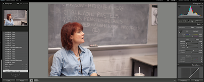
Here's the photo of my drawing teacher that I showed yesterday-- this is it right out of the camera. It had a pretty good exposure to begin with, so I started with adjusting the white balance and adding some blacks and clarity to give it the subject better separation from the background. I sharpen and reduce noise, then will generally make a slight curves adjustment and adjust the brightness some. Like Patti says, set your whites and blacks first, and then work everything in between mainly using gamma.
After that, for this image, I started working with the adjustment brush to tonally adjust specific areas in the picture. I opened up the dark areas of her hair, added highlights to the skin, contrast to the folds in the clothing, and brought down the exposure of the blackboard. I use this tool a lot to enhance the natural textures in the scene. I think a lot about painting and drawing when I do this.
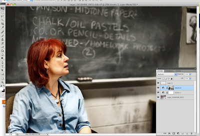
At this point, I opened the image as a smart object in Photoshop to start proofing it for work prints. The file was a little too magenta for the substrate I was going to, so I made a curves adjustment layer, added a very slight s-curve in the shadow/midtone areas on the master channel, and then went into each of the RGB channels, set a midpoint and adjusted each of them very slightly to make it more balanced (in fact, looking at it on my screen at home, it looks a little too green now...).
Patti has made me realize that a lot of times I don't give my images nearly enough density to bring out the tonal richness already there. You don't want to clip out all your blacks, but it is nice to have some true dark values. A similar result could have been achieved earlier in Lightroom, but I used an empty Levels layer set to multiply. Before I added the layer though, I used color range to select the midtones and shadows-- so that when I added the Levels layer, skin and other parts of the image would already be masked off, since I really just wanted to burn in the blackboard and textured areas of the image.

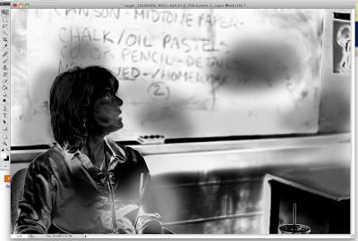
Lastly, I just used the clone stamp on an empty layer to get rid of that soda cup in the bottom right corner. I had some wider shots where the clutter on her desk looked nice, but that one soda cup didn't really work.
Also, since I was working with a smart object, I used the unsharp mask as a smart filter; smart filters are nice because they work like a layer mask, and you can go back and edit them depending on what different surfaces you may be printing to, what areas you want to be sharper, etc.

On to self portraits....
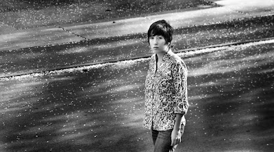
I really struggle with self portraits. I admire people that are able to do this as part of a daily routine, like brushing teeth. I also have trouble with focusing and things that are much easier to do when you're behind the camera. It's a challenge to compose, light, and focus on yourself; the only thing I can really say is that it does get easier with practice somehow. Using greater depth of field or placing another person or an object where you will be and pre-focusing can help. Honestly this picture is far from perfect-- the light and composition is nice, but I am still back-focused just a little bit and it drives me nuts. It's amazing how something simple like focusing can throw you off. It also helps to remember that, even if your lens isn't really bright, when you are all the way open, even the plane in focus will be just a little bit soft. Try stopping down to make focusing easier at first, and when you get everything else worked out, then I'd try using depth of field more creatively.

Okay, I hope I didn't bore you all to death. I've probably left out some finer points, but this is basically how I work (and Patti, feel free to chime in if I've explained something wrong or am misleading the youth). Keep in mind that this is just some technique I've found has worked nicely for my images, but it's certainly not relevant to everything. Being a big geek helps me be able to use software more intuitively, but if anything, experiment to hell with it until you don't have to think about what each little button does. Just like when we picked up cameras for the first time or went into the studio not knowing how anything worked, this is just one more part of process you have to learn. Don't think of it as some separate part that's detached from your artistry, but as a cohesive part of your developing craft.